My Ideal Job
After attending Edward Tufte's seminar, I realize this is my ideal job - I just need to find one. Blog readers are welcome to make suggestions. It is the perfect combination of art and science - turning data into a visual presentation.
Check his website at www.edwardtufte.com
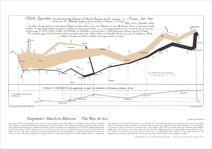
This is one of his favorite examples from history - a map/diagram/chart/anti-war poster available on his website.
"Probably the best statistical graphic ever drawn, this map by Charles Joseph Minard portrays the losses suffered by Napoleon's army in the Russian campaign of 1812. Beginning at the Polish-Russian border, the thick band shows the size of the army at each position. The path of Napoleon's retreat from Moscow in the bitterly cold winter is depicted by the dark lower band, which is tied to temperature and time scales."
posted by Marilynn @ 12:41 PM
0 comments
![]()
![]()


0 Comments:
Post a Comment
<< Home